How to Optimize Your LeafLink Menu

A good Public Menu means more conversions, and that’s why we’ve created a guide on how to best optimize your LeafLink menu.
LeafLink’s Public Menus have gotten a facelift! If you’re not familiar, the Public Menu is a version of your LeafLink brand menu that is discoverable on the web and can be accessed without logging into LeafLink, which means you can share it directly with retailers by linking out to it on your website and emails. A user-friendly, optimized menu has the power to strengthen the customer experience, and encourages retailers to try your products and become long-term advocates of your brand. This is the time to show off your brand, personality, and everything your company stands for!
The new Public Menu pulls the best parts of your brand menu – including your brand banner, brand description, and product photos – into an optimized and user-friendly page that puts your brand first.
In this how-to guide, we’ll walk you through how to optimize your LeafLink menu, so you can get the most out of visitors to your Public Menu and your menu within the marketplace. Current LeafLink customers can also get a more detailed breakdown of how to build a public menu by referencing the Go-Live Checklist knowledge base article.
1. Set up your brand page
This includes all the pertinent details about your brand, from your address and URL, to your description and logo, to your social media handles.
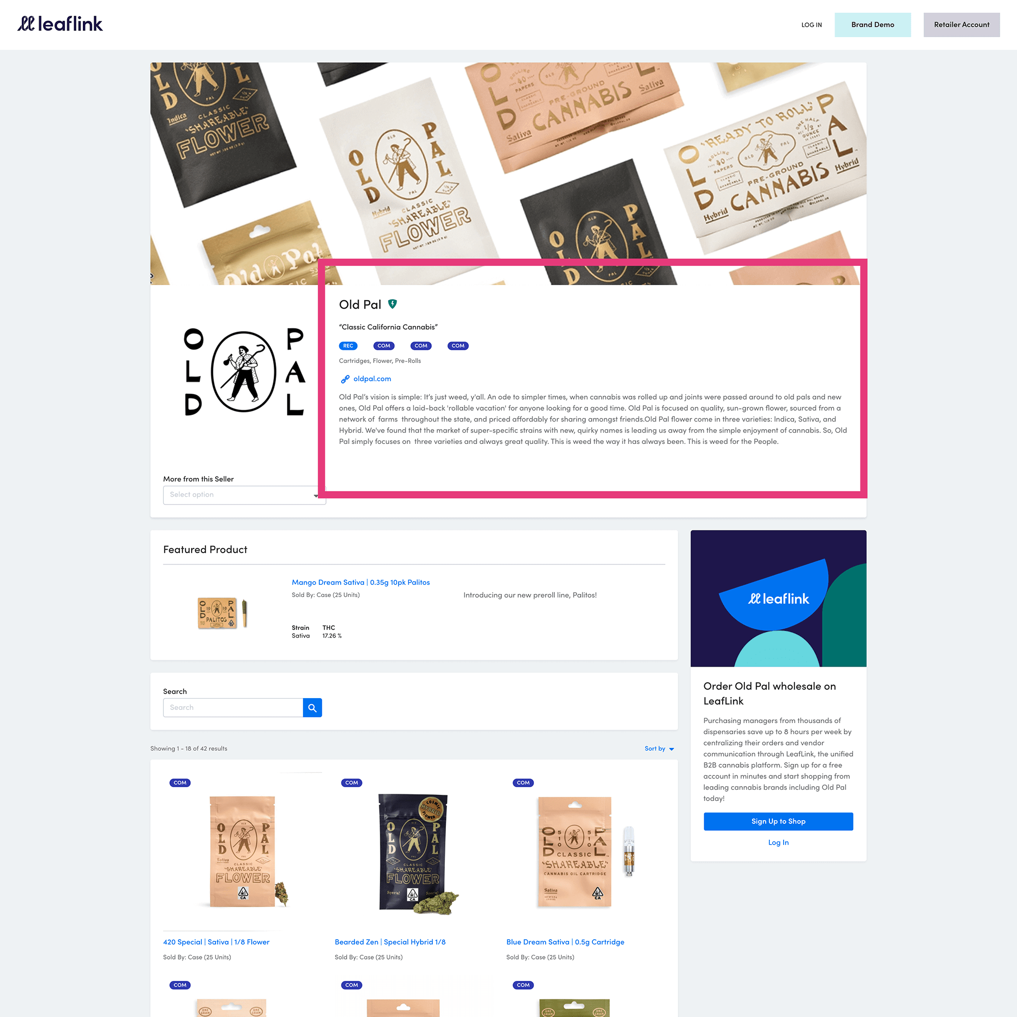
This section’s most prominent field is the brand description. We recommend a concise statement that shares your brand mission and what makes you unique. You’ll have more room to talk about individual products, so this is where you should focus on who you are as a company.

The above image is what a brand description looks like on a Public Menu.
You should also take advantage of the visual real estate in this section by uploading a logo and a brand banner. We recommend a file size of 268 H x 228 W and under 200kb for your logo. The brand banner (similar to a Cover Photo on Social Media sites) can be either a PNG or JPG image, at 3000 x 850 or 1500 x 425, and 2mb or less. Some of our favorite brand banners are graphic patterns, editorial product photography, or lifestyle shots. We recommend double-checking all images after you upload them to make sure they’re not pixelated and the quality looks good.
Another great feature is the brand announcement section. We’ve found it incredibly effective to surface a promo code here – discounts attract both current and new customers to encourage them to try out products, driving sales and profitability in the process. Holidays – both national and cannabis-specific – are important and predictable trends to capitalize on. Consider leveraging the brand announcements section to highlight promo codes or holiday deals for 4/20, 7/10 (if you sell concentrates), and Green Wednesday (the Wednesday before Thanksgiving).
2. Add your product lines
A product line is a section of your menu dedicated to a certain type of product. We recommend dividing up your products into separate, distinct categories to make it easier for customers to find what they’re looking for on your menu. Suitable categories include:
• Flower
• Edibles
• Concentrates
• Tinctures
• Topicals
• Accessories
Curious which product lines are most popular in your market?
With MarketScape, our competitive data product, you can track which product categories and subcategories are gaining or losing popularity in your state. You can also see how your specific products rank against your competitors.
3. Add your products and inventory
Now it’s time to add products and inventory to your menu. This is the time to really let your products shine. Below are some tips on how to create the perfect product page.
Product Descriptions
Detailed descriptions of each product will allow buyers to understand what makes the product unique. Be sure to include things like the effect of the product, and what it tastes like (if applicable).
Product Specifications & Dosage
Product specs and dosage provide essential information, and attest to the quality of the product, and go a long way for retailers in visualizing and understanding its various attributes. Ingredients, the type of strain, and cannabinoid contents are all important things to convey in this section.
Product Images
Quality product photography is a differentiator on the marketplace. Not only does it demonstrate your brand’s professionalism, but it’s also a good opportunity to give buyers a good look at your products. We recommend standardization of your product photos, keeping them all on the same background for consistency. If you can have a professional photographer shoot all your products at the same time, you’re likely to have a good result. If you have great packaging, this is a time to show that, too. Buyers are thinking about merchandising and how things will look on the shelf. Some brands do a great job of styling photos that show both packaging and the product itself. Have fun with it, and let your brand speak!
Tip for flower brands: Close-up images of flower are highly recommended – they reveal the trichomes and crystals that make them so appealing.
Image file sizes should be square, and 600×600.
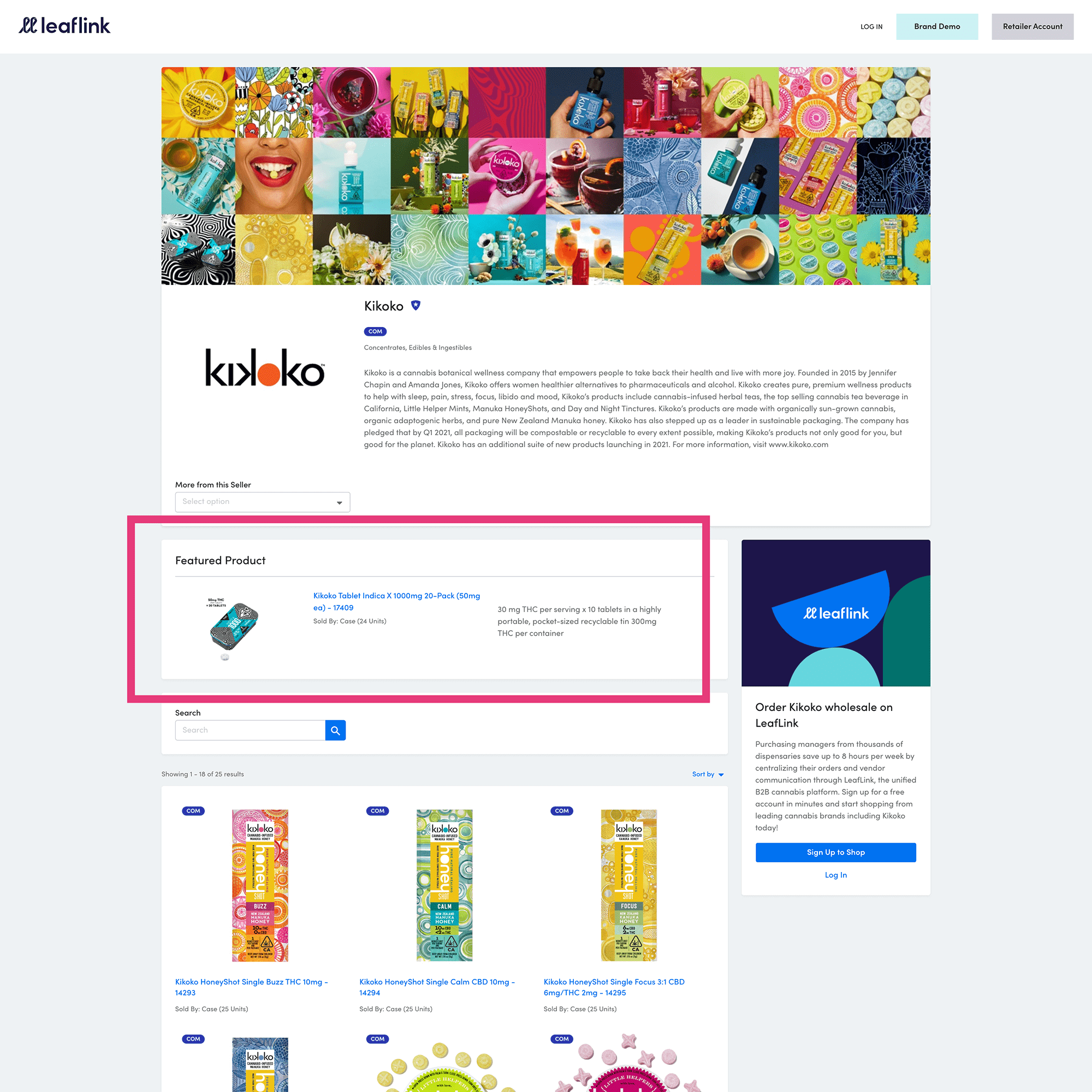
This is also a great opportunity to set a featured product, which will display top and center on your Public Menu. We recommend highlighting your best-selling product or a new item that you want to generate some buzz about.

To sum it all up….
Your LeafLink brand menu is critical to the success of your online sales, and should aim to educate and inform buyers about your brand and your products in the most compelling way. Now is the time to refresh your brand menu, because we’ve updated Public Menus to showcase more of your brand identity.
Use this guide as a reference to help you make sure that your brand menu has all the crucial elements needed to ensure you’re putting your best foot forward to buyers within the LeafLink marketplace and beyond.